Friday, 30 November 2012

Design for Web//5 Bad website designs

1. Alessandro Giua

http://www.alessandrogiua.it/


Even though, at first glance this website is simply layout out and fairly minimalistic, it was actually quite confusing to navigate. When landing on the page it is ambiguous to what information is actually being delivered. 


2. HGX Graphics

http://www.huntgraphic.com/moto.htm


Their really isn't much right about this website design. The colours and typefaces are overpowering and take away from the actual information that is trying to be put across. The layout is overcrowded and overall their is just too much going on. You do not know where to look and gives a sense of dizziness as stands out so much. It does not look very professional. 


3. Testermans

http://www.testermans.co.uk/ 


It is obvious that this website was probably once quite simple and well laid out, but overtime, the design has been overlooked as as more products have been added to the website, the more crowded it has become. The list one the left hand side has too many links to different pages, making it overwhelming. As well as images of products, their is also too many promotion adverts, making it difficult to work out which bits to look at. 


4. Lipsoft

http://www.esupersoft.com/lips/


This website is pretty confusing as it begins with some sort of slide show before taking you to the navigation page which has too many page links. The bright green colour is too over the top and distracts from the content. Too many type faces are used on the web page, overall it has appalling design. 


5. Computer Physicians

http://home.comcast.net/~computerphysicians/


Even though this simple is basic with a white background and a simple typeface  the design is incredibly boring. It does not have much structure, with a long scroll bar just going up an down. The page is nor very engaging or eye-catching. 


Thursday, 29 November 2012

Design for web//5 good websites

1. Virginia Kraljevic

http://www.virginiakraljevic.com/


This website has a fairly simple navigation bar which links to relavent pages. The design is straight to the point and easy to get around the website. The main focus is the actual work rather than the design, the colour is simple and not overpowering. 


2. Red Antler

http://redantler.com/about/


This website portrays an easy navigation bar and a very clear layout. The white background allows the brighter coloured type look appropriate and eye-catching. The titles stand out because of the font and point size. In the 'Work' section, the grid format is effective and looks professional. 


3. Innocent Drinks

 http://www.innocentdrinks.co.uk/


This website shows a good balance between an illustrative style and simple design format. The subtle typeface and clear layout balances out the quirky backgrounds and products. The navigation is incredibly easy to understand and the website does not overload the audience with too much written information. 


4. New Zealand Opera

http://nzopera.com/events/


This website is a bit different but is still very easy to navigate  The aesthetics are very eye-catching yet the colours are subtle and calming. The typography is a focal point of the landing page, the gold really allows the generic typeface to stand out. Overall, the website has quite a classy and slik look to it. 


5. Levis

http://us.levi.com/home/index.jsp?clickid=header_logo


The Levi US website needs to remain pretty simplistic as their are a lot of categories an pages that are linked from the home page. The website keeps its traditional brand identity throughout out the website including colourways and type. 


Lecture 7//Celebrity culture

What the lecture will look at:

  • The history of a celebrity.
  • The relationship between photography/film/tv and celebrity.
  • The culture significance of celebrities.
  • Contemporary icons as case studies.

Julia Margaret Cameron

  • Celebrity portraits , late 19th century to early 20th century. 
  • Painting, soft focus, toning, romantic/theatrical themes.

The Bride (1869)

Mariana

  • "She said I am a weary, weary" 1875.
  • Sisters are often acting scenes from mythology.
  • Christina, sister, both famous for aesthetic artists like Whistler, Dante.

English poet Alfred Lord Tennyson

  • Male celebrities of the day were given a different treatment photographically.
  • More solid, less ethereal. 
  • Pose is more staged, less mythical. 


Invention of moving pictures
Publicizing the idea of a celebrity. 
Louis Aime Augustin Le Prince, from leeds. Inventor of the first moving images. 1888.
'The Silent Era' in film-from that date up to 1927.

The Artist (2011)


Celebrities going in and out of fashion. 


Josephine Baker (1906-1975)

  • Baker costumes for the Danse banane from the Folies Bergeres production Un Vent de Folie in Paris in 1927.
  • Had a Jewish husband.
  • A muse for contemporary authors. 
  • Two sides to public and private persona. 


Influences
  • Celebrities, Glamour, live music and fashion.
  • Beyonce offers references to Josephine Baker.


Golden age of Hollywood
  • Between 1927 and 1960.
  • The jazz singer is the first feature length motion picture with synchronized dialogue.

Clark Glabe
  • 'King of Hollywood  starred opposite many star actresses of the time in the silent films and on stage.
  • US army Air cops during WWII. 


Betty Davis

  • Known for playing unlikeable characters.
  • Married a man who claimed he had never heard of her. 
  • Reversed roles of celebrities and normal people. 
  • The canteen where celebrities served the public.
Marilyn Monroe
  • Opposite
  • Actress, singer
  • Relationships with Arthur Miller and the Kennedy brothers.
  • Iconic as a sex symbol, the spectacle.
  • Her death frezzes her status. 


Andy Warhol-Pop Art
  • Iconic, recognizable
  • Her face becomes a mask and is repeated in the publicity and the news.
  • makes her compelling, mythological. 


Audrey Flack's Marilyn (1977)

  • In the tradition of the 16th/17th century.
  • Photorealism- airbrush. 
  • Difference between person and the painted image.
Elvis Presley 
  • Warhol uses an image of him acting the classic American hero-the cowboy.
  • Blurs our vision, reminds us that the image is all we can see.
  • An icon
Warhols Factory photographed by Richard Avedon (1969)
  • Encourages sub-cultured individuals as a place of expression
  • Factory-idea of the creation of style.
  • Reflection of 60's politics. 
  • Turn them into celebrities.
  • On the edges of society.
John F Kennedy
  • Celebrity politician-youth and good looks.
  • Television speeches.
  • Fashionable, beautiful wife.
  • His death in 1963 was not filmed by the tv cameras but by the public- conspiracy. 
Advent of Television
  • 'Golden age' begins in the late 40's and goes through 50's and 60's. 
  • Focus on drama as entertainment.
  • Late 50's early 60's TV became commonplace in UK and US homes.
The Jacksons as a brand
  • Musicians/performers.
  • 1971 The Jackson 5 had an animated cartoon.
  • In 1976 they star in a comedy acting as themselves
Michael Jackson
  • Looks changed as got older- speculation.
  • Plastic surgery. 
  • Interpreted as reactions to the abuse he suffered from his father as a child. 
Madonna
  • Material girl (1985)
  • Postmodern recycling of the golden Era of Hollywood.
  • Pastiche of Marilyn's performance of Diamonds are a girls Best Friend in Gentleman prefer blondes (1953).
Still from the vogue video (1990)

Reinvents herself for every tour.

Lady Gaga-Brit Awards 2010
  • Recycles image every time she is in the public eye. 
  • Signature style is multiple. 
  • Hard to get in touch with her really self.
Jana Sterbak (1987)
  • Meat dress, influenced Lady Gaga's more modern day version.
  • Creates a reaction.


Barak Obama
  • 'Pop' president.
  • His election seems to offer progress in American politics as he is the first black president.
Youtube
  • Created February 2005.
  • Showcases self-made celebrities.
  • Using pop-culture to get out self-promotion. 
Princess Diana (1971)
  • Represents innocence and beauty as the truth of her marriage to Charles emerges.
  • Reinvents herself as fashion icon as they begin to separate.
  • Seen as a fitting match.
  • As relationship breaks down, Diana reinvents herself.  
The Paparazzi
  • Seems to be the blame of her death in 1997.
  • Celebrities, especially royals, are owned by the public. This idea is reinforced with funerals. 
  • Bigger celebrity, the more traumatic the loss.
Whitney Houston's Funeral (2012)
  • A commercial value to celebrity deaths.
  • Prices for music are hyped.
  • Public expected to buy albums as a reaction to her death.
David Beckham
  • Contemporary 'everyman'.
  • A brand.
  • Cross worlds of sport, fashion and music.
Imitation of celebrity
  • Tribute bands.
  • Industry revolved around this concept. 
Alison Jackson private (2004)
  • 'Apparently 'caught' in a private moment. 
  • Uses methods to portray a spied on moment.
  • Through windows, doors.
  • Implied being looked at.
  • Uses look-a-likes.


As seen on stars
  • Asos, a way to sell clothes.
  • Become a celebrity by dressing/looking like them.
Pierre and Giles
  • Before photoshop used widely.
  • Retouched.airbrushed images.
  • Studio sets.
  • Colours from Indian religious posters.

Shiva and Family/Madonna

Jun de Junes

Alexander McQueen and Isabella Blow (1996)


John Stezaker from the Marriage series (2006)


Twitter
  • Since 2006.
  • Follow celebs.
  • Details of private life.
  • Read through thoughts.
  • Can get obsessed. 
  • Line between public and private.

Friday, 23 November 2012

Lecture 6//critical positions on popular culture

What is Culture?
•‘One of the two or three most complicated words in the English language’
•general process of intellectual, spiritual & aesthetic development of a particular society, at a particular time
•a particular way of life
•works of intellectual and especially artistic
significance’


Marx's Concept of Base / Superstructure
Base
forces of production - materials, tools, workers, skills, etc.
relations of production - employer/employee, class, master/slave, etc

Superstructure
social institutions - legal, political, cultural
forms of consciousness - ideology *


Ideology 1.  system of ideas or beliefs (eg beliefs of a political party)
2.  masking, distortion, or selection of ideas, to reinforce power relations, through creation of 'false consciousness'.


Raymond Williams (1983) ‘Keywords’
•4 definitions of ‘popular’
–Well liked by many people
–Inferior kinds of work
–Work deliberately setting out to win favour with the people
–Culture actually made by the people themselves
Inferior or Residual Culture
•Popular Press vs Quality Press
•Popular Cinema vs Art Cinema
•Popular Entertainment vs Art Culture

Caspar David Friedrich (1809)‘Monk by the Sea'


Matthew Arnold (1867) ‘Culture & Anarchy'


•Culture is 
–‘the best that has been thought & said in the world’
–Study of perfection
–Attained through disinterested reading, writing thinking
–The pursuit of culture
–Seeks ‘to minister the diseased spirit of our time’


Frankfurt School – Critical Theory


Institute of Social Research, University of Frankfurt, 1923-33  University of Columbia New York 1933-47
University of Frankfurt, 1949-
  
Theodore Adorno
Max Horkheimer
Herbert Marcuse
Leo Lowenthal 

Walter Benjamin 


‘Authentic Culture vs Mass Culture’
Qualities of authentic culture 

•Real
•European
•Multi-Dimensional
•Active Consumption
•Individual creation
•Imagination
•Negation
•AUTONOMOUS 


Products of the contemporary ‘Culture Industry’


Walter Benjamin
‘The Work Of Art In The Age Of Mechanical Reproduction’

1936

‘One might generalise by saying: the technique of reproduction detaches the reproduced object from the domain of tradition. By making many reproductions it substitutes a plurality of copies for a unique existence. And in permitting the reproduction to meet the beholder or listener in his own situation, it reactivates the objects produced. These two processes lead to a tremendous shattering of tradition… Their most powerful agent is film. Its social significance, particularly in its most positive form, is inconceivable without its destructive, cathartic aspect, that is, the liquidation of the traditional value of the cultural heritage.'


Tuesday, 20 November 2012

Design for print//Paper formats

Paper sizes


'A' Series
The international paper size standard, ISO 216, is based on the German DIN 476 standard for paper sizes. ISO paper sizes are all based on a single aspect ratio of square root of 2, or approximately 1:1.4142. The base A0 size of paper is defined to have an area of 1 m2. With this definition and the given aspect ratio of square root of two, one can calculate the sides of an A0 sheet as follows: The long side is 1 metre multiplied by the square root of the square root (that is, the fourth root) of 2 and the short side is 1 metre divided by the same. Rounded to millimetres, the A0 paper size is 841 by 1,189 millimetres (33.1 in × 46.8 in).
Successive paper sizes in the series A1, A2, A3, and so forth, are defined by halving the preceding paper size along the larger dimension. The most frequently used paper size is A4 210 by 297 millimetres (8.3 in × 11.7 in)

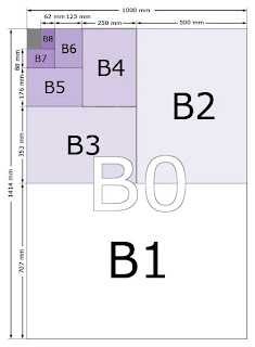
'B' Series
In addition to the A series, there is a less common B series. The area of B series sheets is the geometric mean of successive A series sheets. So, B1 is between A0 and A1 in size, with an area of 0.707 m2 (\sqrt{1/2} m2). As a result, B0 is 1 metre wide, and other sizes in the B series are a half, a quarter or further fractions of a metre wide. While less common in office use, it is used for a variety of special situations. Many posters use B-series paper or a close approximation, such as 50 cm × 70 cm; B5 is a relatively common choice for books. The B series is also used for envelopes and passports. The B-series is widely used in the printing industry to describe both paper sizes and printing press sizes, including digital presses. B3 paper is used to print two US letter or A4 pages side by side using imposition; four pages would be printed on B2, eight on B1, etc.


'C' Series
The C series is used only for envelopes and is defined in ISO 269. The area of C series sheets is the geometric mean of the areas of the A and B series sheets of the same number; for instance, the area of a C4 sheet is the geometric mean of the areas of an A4 sheet and a B4 sheet. This means that C4 is slightly larger than A4, and B4 slightly larger than C4. The practical usage of this is that a letter written on A4 paper fits inside a C4 envelope, and a C4 envelope fits inside a B4 envelope.

http://en.wikipedia.org/wiki/Paper_size