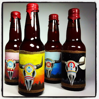
Here are some existing beer designs. Not all of them are an appropriate style for Leeds Brewery's 'Hellfire' but it is interesting to look at other approaches and how the design links to the beer that is being promoted.
The label design on the left is very current and is legible. It has a contemporary feel to it and works as a set. The type face is quite soft but sits well on the bottle. It is aesthetically pleasing but don't not really communicate any information of culture or personality. The bottle on the right hand side
The bottle on the left has an attractive illustrative style. It also give the idea of a seasonal, wintery beer with the imagery. Even though the illustration looks quite intricate, the colour way and type is simple making it bold. The bottle on the other right is traditional with a modern twist. the silhouette imagery works well against the smooth coloured background.
This bottle design is very different to your average beer. The colours are eye-catching and the imagery is inventive. However, type is important on any drinks packaging and it straight away communicates what it is. The design is fun but lacks legibility.
This design was picked purely to show the never ending boundaries with what design can bring. It would not necessarily fit the Leeds Brewery brief, but it is interesting to see how this concept of using origami to sell a product can be applied. It is important to experiment with different media and take in consideration how effective a process of design is and if it is relavent.
This label design has an stand out typeface which has a certain style attached to it. The rest of the label also adopts this aesthetic. The white works well for the typeface against the black background.
'Hellfire' is a citrus flavoured beer, so it is helpful to see how likewise beers have communicated this. This design is fairly obvious, the use of the colour yellow makes an immediate link to the flavour itself. This 'circus beer' also uses a typeface that communicates this theme.
This bottle design is very simple. The white clean cut label offers a generic aesthetic. The typeface is quite mellow and it is not too clear what the product actually it. It is obviously important to sometimes keep a design minmal and simplistic, but it also needs to sell, and for it to sell it must stand out.
This design communicates legible layout and composition. The pastel colours are a current trend that will appeal to a younger audience and the product works well in a series. However the design and colourways is quite feminine which may not what the product is actually trying to communicate.
The label design is very illustrative and communicates something a bit different yet still eye-catching It will appear to a wide audience. The colour works well to tone down the detail of the illustration. It also gives a sense of personality and product range. The type face put in a place where the illustration is not overpowering it.


No comments:
Post a Comment