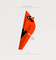
These illustrations are really simple and use subtle shapes to make up the birds. Instead of using lots of colours, different tones of a few colours are combined.
bearseatberries.com
This design is much more full on and quite chaotic. The multiple geometric shapes create an explosion of colour.
www.alicialovesparis.com
This image is actually quite complex but the simple colour pallet and very small shapes create a clear outline. This one was chosen because if the typography is made up of geometric shapes. The closeness of the shapes make the design look as though it is textured.
tokyobunnie.blogspot.com


No comments:
Post a Comment