Tuesday 22 May 2012

OUGD401//Evaluation


What skills have you developed through this module and how effectively do you think you have applied them?
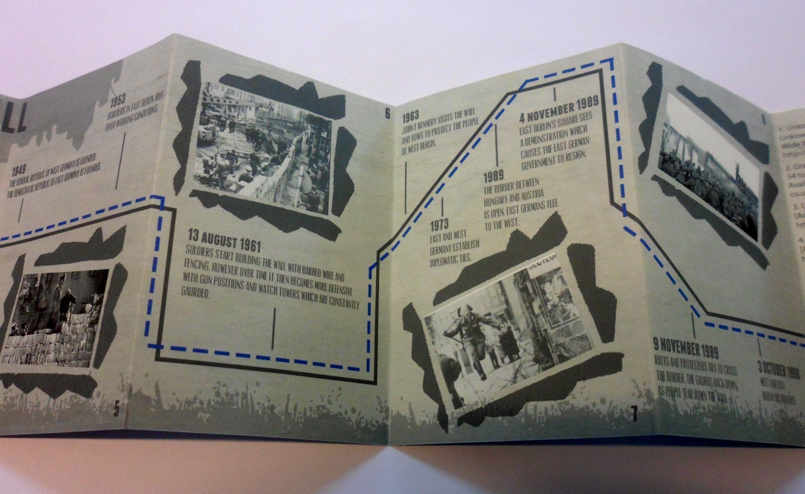
This module has been very different to the others and it has been refreshing and interesting. I have not really done much context of practice before and I have found the seminars with Richard useful to understand contextual links. At the beginning of the module I was not particularly good at picking out the key terms and information and writing them down. I have noticed I have become more selective on picking out relevent information that I will find helpful. I had never done Harvard referencing before the essay in this module. This has been a skill that I would say I have perfected but have definitely learnt a few things about. I think overall I have found the weekly lectures interesting and have added to my knowledge on those subjects. I had never studied Modernism before but felt that I have had applied the knowledge that I have learned in the lecture into my essay as a reasonable standard. At first I found the concept of 'Theory into practice' tricky to understand. It took me a while to find a topic that I was interested in and felt able to design something regarding it. However, when I did find the theory I wanted to focus on I found it easier to put it into practice. My publication was not over complicated and filled with too much information, but for what I was designing I felt it was relevant and did the job. 


What approaches to/methods of design production have you developed and how have they informed your design development process?

This module has taught me that no matter what you are designing, the contextual links and background to the subject is what makes the design valid and relevant. Jo's sessions have given me many approaches to design. I think it is important to know what other work is out there in terms of aesthetics and methods of design. I have also learnt that in order for you to improve your design, it is crucial that you know what kind of design you enjoy and find interesting. So an approach that I have adopted is to be aware of everything that is around the design, not just the design itself. Knowing the environment, contextual links and things that are relevant to you can shape your design direction. Even though essay writing isn't exactly a design process, I think that having the ability to write in a formal manner is important when it comes to writing within design. Also I have learnt that writing an essay of a certain era of design can help you understand it more and therefore apply it to your own design process. 


What strengths can you identify in your work and how have/will you capitalise these?
I think I have become better at understanding how the theory underpins the practice. Before this module I had minimal knowledge on the history of design. I feel as though I have become better at applying the theory into my practice while gaining more knowledge on the subject. I think that by doing Jo's workshops I have become more aware of what kind of designer I want to be and have tried to apply this to my work in design practice. I will continue to research the theory behind design that I am focussing on in the future to help my design improve and have a strong and relevant contextual background.


What weaknesses can you identify in your work and how will you address these in the future?
Even though I enjoy writing and find it interesting when writing an essay on a good subject, I feel as though I was not specific enough within my essay as I had too much to communicate. Their was so much information that I had researched that I was eager to get it all in. I think it might have been better to be more thorough with a narrower topic. However saying that, I do feel as though I captured a broad range of knowledge. I could definitely improve of being more thorough with my research and finding out more designers that inspire me. 


Attendance- 4      Quantity of work produced- 3
Punctuality- 4        Quality of work produced- 3
Motivation-3           Contribution to the group- 4
Commitment- 4

Monday 21 May 2012

Context of Practice//Essay

Focussing on specific examples, describe the way that Modernist art and design was a response to the forces of modernity?

Modernism is ‘A set of aesthetic movements that emerged in Europe in the 1880s, flourished before and after the First World War and became institutionalised in the academies and art galleries of post World War Europe and America’[1] referred to by Boyne and Rattansi (1990: 6). Whereas modernity is the way in which the modern life is experienced. Modernity was a time of innovation and the progression of new ideas. Whether this was expressive in art, architecture and science. Rethinking traditions and altering believes was one of the most powerful forces of modernity, encouraging art and design ever since. Boyne and Rattansi also identified four features that distinguished modernism to pre-modernism, including ‘Self reflexiveness’, ‘montage’, ‘ Paradox, ambiguity and uncertainty’ and finally ‘integrates individual subject’[2] (Boyne and Rattansi, 1990: 6). All of these features were recognized to improve the way in which art and design was defined by the modernist era. ‘A Sunday Afternoon On The Island Of La Grande Jatte’ was cleverly portrayed by painter George Seurat who used a combination of form and colour variation. Along with painters, many artists produced art and design as a response of modernity and these four features. ‘Modernism is a critique of modernity’[3] explains Boyne and Rattansi. (Boyne and Rattansi, 1990: 6).

Within the modernist movement, urban and country life were radically different. In 1900, Paris was known as the most progressive city in the World. This was mainly influenced by urbanisation and industrialisation. In the 1850’s, Haussman, an architect, redesigned parts of the city by inserting narrower streets and larger boulevards so that the streets would be easier to police, forming a new way of social control. The centre also became an upper class zone, creating a divided between the class hierarchies. This was also known as ‘Haussmanisation’. The modernist era was a time of experimentation, especially when it came to the use of materials, construction and scale. The Eiffel tower is one of the most renowned structures in the World. The design itself is an example of a response to modernity. Built from 1887-1889 as the entrance arch to the world fair. Iron was the primary material to construct the tallest tower in France. Tatlin’s tower was a similar design, planned by an architect from Russia, named Vladimir Tatlin but was never constructed. The structure would have be made with iron, glass and steel and presented in a modernist form. These two towers both represent a clear and direct response to the forces of modernity, mainly displaying ‘Truth to materials’ which conveys simple geometric forms that are appropriate to the material being used. Furthermore, ‘Trottoir Roulant’ was an electric moving walkway, which was created in the 1900’s as a new form of transport. The cheap materials and new sites conformed to the design functions of modernism. In this time, technology was becoming a barrier between experiences and the world.  In 1937, Paris also saw the ‘Exposition of internationale’ which saw ‘an anti-fascist alliance of left wing parties, which came to power in 1936’[4](Wood, 2004:12). The parties main ambitions ‘were economic: to stimulate the depressed economy, to reduce unemployment…. and to showcase French products and technology’[5](Wood, 2004:12). Over three hundred pavilions were made, including foreign ones. Josef Thorak was a sculpture for the German pavilion that created modernist strong figurines attempting to represent an ancient Greek sculpture.

Looking into modernism in design shows numerous factors that have come about as a response to modernity. Firstly, ‘Internationalism’ explores the idea of how a piece of art can communicate in an international language. ‘The London Underground’ originally design by Harry Beck, an engineer, is a universal icon of graphic design. The construction of the map displays a form of lines and a key that has been specifically designed for a purpose. This purpose being that it is understood on an International level. The reason that this feature is so effective, particularly in this example, is because of the simplicity in the concept and design. Another focus point is, ‘Anti-historicism’ which portrays the concept of not looking back in time in need to move forward. In terms of design, this means avoiding looking back into older styles. ‘Ornament and crime’ is an essay written by Adolf loos, in 1908, which he describes how objects can easily become out of date and out style, almost suggesting it to have immortality once this process has happened. Lastly, ‘Form follows function’ is a principle often associated with architecture and industrial design. The meaning of the principle is that the way something is constructed is based upon the object or buildings intended purpose. Therefore things are made purely due to its function and not the other way around. Alexander Rodchenko was an artist and graphic designer who explored constructivism and Russian design. His wife, Varvara Stepanova was also a designer. Regarding the principle, ‘Form follows function’, Stepanova designed a series of sports clothes that were comfortable and expressed equality and optimism. The woman designer also increased gender roles in a social context. ‘Her work shows a direct influence of the Cubists and the Futurist art movements and she spent her career dedicated to trying to use her work to create revolutionary change within society’[6] (Design is history, 2012).

Post Germany’s defeat in World War 1, the Bauhaus operated from 1919 to 1933 in Germany, founded by architect Walter Gropius. The building itself was influenced by modernist architecture. The function of the building was to hold a school of art and design. It was somewhere to explore crafts and techniques in a new way. Subjects such as typography, pottery and wall painting were educated. ‘While maintaining the emphasis on craft, [Gropius] repositioned the goals of the Bauhaus in 1923, stressing the importance of designing for mass production. It was at this time that the school adopted the slogan “Art into Industry”’[7] (The Metropolitan Museum of Art, 2012). However, as time has shown, the idea of mass-production was already partly developed in Germany before the Bauhaus. Just like Walter Gropius, nineteenth English artist, William Morris also lead the same importance in terms of form and function when it came to design. Prestigious work from Herbert Bayer was incredibly influential, as he was known to be the last designer who came from the Bauhaus. Bayer’s most well-know work was the discovery of the ‘Universal Type’[8] (Bayer.H 1999), where he experimented with a lower sans serif typeface with an input of geometric shapes and construction. The type on the Bauhaus currently, is based upon this 1925 typeface. It has encouraged typographers all over the world.  Bauhaus didn’t only influence architecture and typography in the modernist era, but also furniture and interior design. Le Corbusier was a modern architecture and furniture designer. He believed in designing for comfort and therefore the modernist believe in ‘form follows function’. He created the ‘Le Corbusier LC2’, which was a sofa and still well recognised as an iconic piece of design. The furniture was within a set, which was referred to as ‘Equipment for Living’ [9](http://www.interioraddict.com, Le Corbusier, 2012) by Corbusier himself. Sticking to the modernist views and regarding ‘truth to materials’, the pieces were made out of leather and steel, which still influences today’s furniture design. The popularity and practicality of Le Corbusier work, just shows how successful the original concept, influenced by the forces of modernity was. So much so that it was referred to as the ‘relaxing machine’[10] (http://www.interioraddict.com, Le Corbusier, 2012).

To conclude, the impact that modernism has had, even in today’s design world is easily once of the most influential art movements. Whether it is architecture, graphic design or furniture, each craft has been carefully progressed and experimented with to ensure radical changes to art and design. There are many principles that have been outlined within the modernist theory, which allows explanation of why art and design, is how it is now. The city of Paris explored many aspects of modernity including Haussmanisation, urbanisation and industrialisation. New technologies and materials have had positive implications on art and design. However, at the same time this caused traditional views and design techniques to be altered. A concept such as ‘form follows function’ is a simple way of allowing design not to be out-dated. When it comes to aesthetics, modernism has influenced this idea of using a variation of media, colour and geometrics such as ‘montage’. The way fashion and photography has been positively encouraged by this era. Equally, an event such as World War 1 was a focal point in the 1900’s. It was a turning point for the movement, encouraging the opening of Bauhaus, Germany which then went on to take traditions and change them into something refreshing. Post modernism then lead on from this movement that took on historic events, influential artists and therefore a change in design. However, overall, the forces of modernity caused a noticeable shift in art and design that has shaped the way that artist works in today’s current society.


Bibliography

1. Boyne.R & Ali.R (1990) Postmodernism and Society, University of Michigan, Macmillan Education.

2. Wood, P (2004) ‘Varieties of Modernism’, London, Yale University Press.

3. Design Is History. (2012). Home: Design Is History. [ONLINE] Available at: http://www.designishistory.com. [Accessed 10 January 2012].

4. The Metropolitan Museum of Art - Home. 2012. [ONLINE] Press 2000–2012 The Metropolitan Museum of Art. Available at: http://www.metmuseum.org. [Accessed 12 January 2012].

5. Bayer.H (1999) ‘Essay’, ‘Anon’

6. Designer Furniture, London Shop. (2012). [ONLINE] Available at: http://www.interioraddict.com. [Accessed 19 January 2012].

7. Hughes.R (2009) ‘The Shock of the New: Art and the Century of Change’, London, Thames & Hudson.

8. Carmel-Arthur.J (2000) ‘Bauhaus’, 1st Edition. Carlton Publishing.

9. Rodrigues.C & Grarratt.C (2001) ‘Introducing Modernism’, 1st Edition ‘Anon’.

10. Christopher. C (2007) Modernism in Art Design and Architecture, USA, St Martins Press.


[1]Boyne.R & Ali.R (1990) Postmodernism and Society, University of Michigan, Macmillan Education

[2] Boyne.R & Ali.R (1990) Postmodernism and Society, University of Michigan, Macmillan Education

[3] Boyne.R & Ali.R (1990) Postmodernism and Society, University of Michigan, Macmillan Education
[4] Wood, P (2004) ‘Varieties of Modernism’, London, Yale University Press

[5] Wood, P (2004) ‘Varieties of Modernism’, London, Yale University Press

[6] Design Is History. (2012). Home: Design Is History. [ONLINE] Available at: http://www.designishistory.com. [Accessed 10 January 2012].
[7] The Metropolitan Museum of Art - Home. 2012. [ONLINE] Press 2000–2012 The Metropolitan Museum of Art. Available at: http://www.metmuseum.org. [Accessed 12 January 2012].

[8] BAYER.H (1999)

[9] Designer Furniture, London Shop. Le Corbusier, 2012. [ONLINE] Available at: http://www.interioraddict.com. [Accessed 19 January 2012].

[10] Designer Furniture, London Shop. Le Corbusier. 2012. [ONLINE] Available at: http://www.interioraddict.com. [Accessed 19 January 2012].


Theory into Practice//Final Printed

Here is the final publication printed. 


Saturday 19 May 2012

Theory into Practice//Finals after crit

Feedback 

The overall feedback received was positive. It was suggested that the frames on the timeline side of the publication should be made grey to match the black and white images and to portray the atmosphere of the historic event. It was also suggested that the covers should be changed around. Some spelling errors were also picked up on. 


Here is the changed publication ready to print. 


Wednesday 16 May 2012

Theory into practice//Finals

Finals before crit
Here is the final layout and design of the publication and sleeve. 


Tuesday 15 May 2012

Theory into Practice//Front cover

Development of front cover

It started off with some typography which I hand-rendered. The style is bold and will hopefully draw attention to the publication. 


The simple black and white does actually work quite well as the type has a strong aesthetic. However as the publication focusses on street art is is appropriate to apply some colour. 


However to many bright colours looks chaotic and childish. I think though that the parts of the lettering looks good agains the grey background. 


Here is an illustration I did that will be part of the front cover design. 


The cover will work as a sleeve that the publication will go in once it is folded. To find the right balance with the colour ways, the word Berlin was applied with two tones of blue. As this is the foucus point of the publication it is appropriate that this word is enhanced. By taking the spray effect from the main part of the publication a frame was created on the back of the sleeve, drawing attention to the centre. 


Experimenting with layout, the previous spray effect was placed on the top and bottom of both the front and back of the sleeve.  


Above is some more typegrophy which I produced and scanned into the computer. 


Once it was scanned in, it was opened in Illustrator and put over the grey background. 

Thursday 10 May 2012

Theory into Practice//Development

Development Continued 


To make the publication look more street art, an effect was added to form a sort of border. 
The timeline was enhance by placing a dotted line over the solid line. 


The grey background was then applied again. The timeline photos work really well against the frames. 


Text was then added about each artist and their work. I wrote the information in my own words. The typeface works well as it stands out and the light shadowing on the headers enhance the lettering. 


The information on the timeline was also typed up in the same typeface. 


Wednesday 9 May 2012

Theory into practice//Images used

These are the images that will be used in the publication to communicate the work at the East Side Gallery. 

http://www.flickr.com/photos/markturner/4019917104/

http://www.flickr.com/photos/lesleypowell/2532175388/

http://globe-m.de/de/users/dmitri-vrubel-und-viktoriya-timofeeva


http://www.blog.lalydesign.co.uk/2012/05/keith-harring-would-have-been-54-today/


The photos below will be used in the timeline of the publication. 


http://timpanogos.wordpress.com/2007/08/13/berlin-walls-46th/


http://timpanogos.wordpress.com/2006/08/13/berlin-walls-45th/


http://thecommune.co.uk/category/former-eastern-bloc/


http://constitutionclub.org/2011/10/


Tuesday 8 May 2012

Theory into practice//Development

The publication is going to be a double sided booklet consisting of five A6 pages on each side. The idea is to have popular and controversial art work from the East Side Gallery in Berlin hanging in a frame of some sort from a wall like background. 


 The city landscape stencil was then made grey to put onto the layout upside down as a sort of border.  


The layout of frames and images was continued experimenting with. 


To create a wall aesthetics this texture from http://lostandtaken.com/ was played around with on photoshop and will be the background. 

The other side of the publication will be a timeline of the Berlin wall from when it was built to when the East and West were reunited. 
To make the frames look more as if they are hanging from a wall, some aesthetics were added to bring this idea across. The frames were also angled to enhance the look. 

 
One side of the publication is on the East Side Gallery which is a celebration of art work from the Berlin wall therefore adding more colour seemed appropriate. The spray painted frames had colour applied to them to make them stand out against the grey background.