Wednesday 26 October 2011

Proverbally yours// Message & Interpretation

Typefaces

'Where stars shine the brightest' 

'Dandelion in the Spring'

'Hand of Sean' 

'Claire Hand' 

'Talking to the moon' 

'Secret code' 

'Champagne' 

'Opificio'

all fonts are from http://www.dafont.com

Here are a selection of typefaces that could work well within a poster for the proverb 'Sill waters run deep'. The ones chosen are not very intimidating or aggressive fonts. In fact they kind of have a handwritten effect which is quite calm and light. Equally they still stand out, especially if the were against a blue background that isn't too overpowering. 

Proverbally yours// Message & Interpretation

Existing Posters

http://edenspiekermann.com/

http://designyoutrust.com/

http://designyoutrust.com/

http://gra2173ingloriousbaselines.wordpress.com/

http://circleboxblog.com/

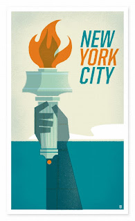
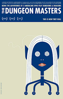
Above shows some posters that communicate simplicity but are just as effective and impacting than posters that carry lots of information. Often, posters or flyers that display bold, simple imagery with a small colour pallet and only a few typefaces are the ones that draw an audience in and maybe leave people curious. This may lead the audience to take action and maybe search a website that is linked to the poster or change the actions they take in everyday life. If the poster portrays simplicity, the target audience is much wider as it can relate and communicate to more people. 

Tuesday 25 October 2011

Proverbally yours// Message & Interpretation

Icebergs
 http://express.howstuffworks.com/


http://27gen.blogspot.com/

http://www.creditwritedowns.com/

http://www.antiwarart.co.uk/

http://nooomaaas.wordpress.com/

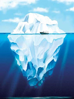
Here is a collection of iceberg images. The perception of an iceberg is different to each person and many people have never seen one in real life, especially one from an underwater angle. Some these images are more realistic than others. Many are actual photograph, some are paintings and are few is photoshopped. It is interesting to see how the image catches the light to communicate the impact of the bottom half of the iceberg. Also, the colours are very eye-catching and immediately draw in an audience. Most of these images have an element of surprise and shock.  


Monday 24 October 2011

Revolutionary Design


Jo's Task 2

A crit is....
...Analysis of work, progress and experimentation. 
...Meeting the brief.
... Receiving constructive criticism
...To help improve/modify work. 


DIET
D- Describing (What is here?).
I- Interpreting (What about?).
E- Evaluating (How good is  it?).
T- Theorising (Does it solve the problem?).


My Ten Questions
1. Where would you find it?
2. What is it saying/communicating?
3. How well do the colourways work?
4. How was it made?
5. Where did the original go? 
6. In what context is it used?
7. What was the inspiration? 
8. Does the concept and aesthetics work well together? 
9. Is it straight to the point or is it complex?
10. Who is the target audience? 

Tuesday 18 October 2011

Jo's Task 1

Examples of Illustration, Logo's, Typography & Photographs


Typography by Virginia Kraljevic

      
Typography by Scott Albrecht 
           

Photography by Lee miller


Photography by Tim Walker 


Innocent Smoothie logo


Fair trade logo 


Illustration by Martin Hake 


Illustration by Harriet Russell 


Wednesday 12 October 2011

Lecture 2//Post Modernism


Alphabet Soup//Typeface

Existing Alphabets


'Disco Deck' 


'Disco Duck' 

'Captain America' 

'Nova Solid'

'Full moon on mar's' 

Above is a collection of alphabets that are bold yet have a certain style to them. They aren't exactly conventional but are very much still legible. In terms of communicated an idea of a bold personality these alphabets would do this yet at the same to still have space to develop and alter to create a layer effect to convey an hidden personality trace. 

Tuesday 11 October 2011

Study Task 2 continued//Image Analysis Essay

Both images presented portray variations of messages, typography and context. After further exploration it is apparent that both images convey many similarities and some contrasting differences. 

The Uncle Sam Range (1876) advertising image by Schumacher and Ettlinger promotes Brand Identity. At first glance the advert is rather ambiguous. However, it soon becomes clear that the image is promoting an oven. In contrast to this, the other image presented is incredibly direct and clear to what it is advertising. A poster by Savile Lumley (1915) is targeting males to encourage them to join the army and go to War. In particularly, it is the typography and slogan that captures the audience in a direct and obvious manner; ‘Daddy, what did YOU do in the Great War?’ The emphasis on the word ‘You’ implies an inclusive rhetorical question, attempting to make the audience feel guilty and unsupportive of their country. Furthermore, the style of typography selected is not shown in an aggressive way but in quite a glorified nature. On the other hand, the typography used in the contrasting advert displays a bold, West-American style, conveying a patriotic theme that is expressed throughout the advertisement.

The symbolism in the oven image is incredibly relevant. The original perception of the advert is that it is very busy. The main focal point is the idea of a dinner party hosted by men and served by a woman. The gender roles immediately support the time and audience that is targeted. Similarly the food is being cooked by a servant, which also suggests that this advert is aimed at the higher class Americans. Similarly, Lumley’s poster also uses aspects of family to encourage its audience. The composition of the figures within the poster portrays a daughter sitting on her fathers lap reading a book on the War and his son playing on the floor with toy soldiers. This is ironic because it even though the poster was made before the War had ended; it is looking at it in from a futuristic perspective therefore implying that the War was going to become an international phenomenon. Interestingly the image is also presented quite an adoring, perfected family way. Therefore, also expressing to the target audience that post-war will be a safe, wealthy and promising place to be for Great Britain.

Both adverts suggest an intense sense of pride of their countries. In particularly, The Uncle Sam Range advert shows a illustrated globe displaying a face. The face is mocking and suggests that America is superior to other countries. Further more, the globe character is holding a list, which contains food from each country that the company think they would make ‘China…Birds nests boiled’ and ‘America…roast beef’. These false views imply that America is trying to encourage their target audience by displaying wealth and progression. Ultimately, the advert is displaying a comfortable lifestyle, which has occurred through the purchase of the company’s oven, therefore implying that everyone in America can also strive for this way of living. Similarly, the poster portrays a sense of how your life will certainly improve if you go to War. Whereas, in actual fact the image is sending a deceiving message.