Friday 28 December 2012

ISTD//Women's surf events

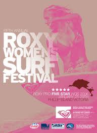
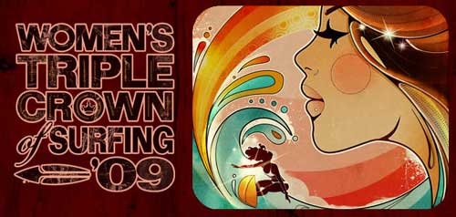
Opposed to the males surf event promotions, here are some women ones. The aesthetics are very different. They are still very colourful but softer tones are used. Much lighter typefaces are used but still remain a focal point of the promotion. Their is more illustration based posters as-well instead of just photography which adds a feminine touch.  


www.prosurfing.com
www.surfersvillage.com


www.prosurfing.com
www.surfing-waves.com


www.behindmagazine.com


www.surfersvillage.com


Thursday 27 December 2012

ISTD//Male surf events

Surf events held for either men or women need some form of advertisement and promotion. It is interesting to see the difference between the genders and how they appeal to the target audience. Looking at the aesthetics in the female event in particular will influence the design for my publication. 

Male events


surf.transworld.net
www.eightyonedesign.co.uk


www.surfns.com


www.ukprosurf.com


www.prosurfing.com
www.surfersvillage.com

These surf posters and flyers promoting the male surf events display masculine aesthetics. The colours are quite strong as vibrant  The type also has a quite a big impact. Most of the typefaces bold and are a main focus of the overall image. Also, a lot of these pieces of promotion have quite a chaotic style communicating to the audience. 


Sunday 23 December 2012

ISTD//Imagery

Within the women's surfing world it is important that it expresses the essence of the sport and its lifestyle it has adopted. Even though photography has already been look at in a sense of capturing a moment, it is interesting to see how other companies are showing the powerfulness and spirit of the sport. The tag lines that surf company, Roxy use are really inspiring and are directed at girls who surf. Their overall imagery isn't too girly but gives a subtle femininity. 


www.roxy.com

Saturday 22 December 2012

Responsive//Greeting cards//Artist Research

Yulia Brodskaya

Yulia Brodskaya was born in Russia (Moscow); prior to moving to the UK in 2004 she was interested in diverse creative practices ranging from Textile Painting, Origami and Collage to more traditional Fine Art practices. Following an MA in Graphic Communication (2006, University of Hertfordshire) she continued to experiment and explore ways of bringing together all the things she likes most: typography, paper, and highly detailed hand-made craft objects. She has swiftly earned an international reputation for her innovative paper illustrations and continues to create beautifully detailed paper designs for clients all around the world.


http://www.artyulia.com/

Yulia's work is obviously a very detailed and skillful approach to quilling. but her work is inspiring and beautiful to look at. 


Friday 21 December 2012

Responsive//Greeting cards//Quilling

Looking into to Arts and crafts but specifically quilling. Finding the balance between an approach that embodies the traditional skill but not too showing an old-fashioned aesthetic. It is important that it will appeal to a younger audience. Paper-cutting was a big trend in the card industry and papercraft in general is delicate and aesthetically pleasing when done right. Here are a few examples are what has already been done. 


http://pinterest.com/search/pins/?q=quilling+cards


ISTD//Photography

Here are few images collected from Tumblr displaying female surfing. They are all quite different to see which ones would be more appropriate. Some photos communicate short boarding  others long boarding and some just show a lifestyle. Having a collection of surfing photographs all next to each other makes it obvious which are the most powerful and what king of product is going to be produced from them.