Tuesday 30 October 2012

Design for Print//Colour Modes


CMYK 
The CMYK color model (process color, four color) is a subtractive color model, used in color printing, and is also used to describe the printing process itself. CMYK refers to the four inks used in some color printing: cyan, magenta, yellow, and key (black). Though it varies by print house, press operator, press manufacturer, and press run, ink is typically applied in the order of the abbreviation.
The "K" in CMYK stands for key since in four-color printing cyan, magenta, and yellow printing plates are carefully keyed or aligned with the key of the black key plate. Some sources suggest that the "K" in CMYK comes from the last letter in "black" and was chosen because B already means blue. However, this explanation, although useful as a mnemonic, is incorrect.
The CMYK model works by partially or entirely masking colors on a lighter, usually white, background. The ink reduces the light that would otherwise be reflected. Such a model is called subtractive because inks "subtract" brightness from white.
In additive color models such as RGB, white is the "additive" combination of all primary colored lights, while black is the absence of light. In the CMYK model, it is the opposite: white is the natural color of the paper or other background, while black results from a full combination of colored inks. To save money on ink, and to produce deeper black tones, unsaturated and dark colors are produced by using black ink instead of the combination of cyan, magenta and yellow.
http://en.wikipedia.org/wiki/CMYK_color_model


RGB

The RGB color model is an additive color model in which red, green, and blue light are added together in various ways to reproduce a broad array of colours. The name of the model comes from the initials of the three additive primary colours, red, green, and blue.
The main purpose of the RGB color model is for the sensing, representation, and display of images in electronic systems, such as televisions and computers, though it has also been used in conventional photography. Before the electronic age, the RGB color model already had a solid theory behind it, based in human perception of colours.
RGB is a device-dependent color model: different devices detect or reproduce a given RGB value differently, since the color elements (such as phosphors or dyes) and their response to the individual R, G, and B levels vary from manufacturer to manufacturer, or even in the same device over time. Thus an RGB value does not define the same color across devices without some kind of color management.
Typical RGB input devices are color TV and video cameras, image scanners, and digital cameras. Typical RGB output devices are TV sets of various technologies (CRT, LCD, plasma, etc.), computer and mobile phone displays, video projectors, multicolor LED displays, and large screens such as JumboTron, etc. Color printers, on the other hand, are not RGB devices, but subtractive color devices (typically CMYK color model).
This article discusses concepts common to all the different color spaces that use the RGB color model, which are used in one implementation or another in color image-producing technology.

http://en.wikipedia.org/wiki/RGB_color_model


Hexachrome
Hexachrome was a six-color printing process designed by Pantone Inc. In addition to custom CMYK inks, Hexachrome added orange and green inks to expand the color gamut, for better color reproduction. It was therefore also known as a CMYKOG process. Hexachrome was discontinued by Pantone in 2008 when Adobe Systems stopped supporting their HexWare plugin software. While the details of Hexachrome were not secret, use of Hexachrome was limited by trademark and patent to those obtaining a license from Pantone. The inventor of Hexachrome was Richard Herbert, who is also the president of Pantone Inc.
http://en.wikipedia.org/wiki/Hexachrome


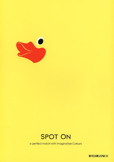
Spot Colour

In offset printing, a spot color is any color generated by an ink (pure or mixed) that is printed using a single run.
The widely spread offset-printing process is composed of four spot colors: Cyan, Magenta, Yellow, and Key (black) commonly referred to as CMYK. More advanced processes involve the use of six spot colors (hexachromatic process), which add Orange and Green to the process (termed CMYKOG). The two additional spot colors are added to compensate for the ineffective reproduction of faint tints using CMYK colors only. However, offset technicians around the world use the term spot color to mean any color generated by a non-standard offset ink; such as metallic, fluorescent, spot varnish, or custom hand-mixed inks.
When making a multi-color print with a spot color process, every spot color needs its own lithographic film. All the areas of the same spot color are printed using the same film, hence, using the same lithographic plate. The dot gain, hence the screen angle and line frequency, of a spot color vary according to its intended purpose. Spot lamination and UV coatings are sometimes referred to as 'spot colors', as they share the characteristics of requiring a separate lithographic film and print run.

http://en.wikipedia.org/wiki/Spot_color


The Pantone Color Matching System
The Pantone Color Matching System is largely a standardized color reproduction system. By standardizing the colors, different manufacturers in different locations can all refer to the Pantone system to make sure colors match without direct contact with one another.
One such use is standardizing colors in the CMYK process. The CMYK process is a method of printing color by using four inks — cyan, magenta, yellow, and black. A majority of the world's printed material is produced using the CMYK process, and there is a special subset of Pantone colors that can be reproduced using CMYK. Those that are possible to simulate through the CMYK process are labeled as such within the company's guides.
However, most of the Pantone system's 1,114 spot colours cannot be simulated with CMYK but with 13 base pigments (15 including white and black) mixed in specified amounts.
The Pantone system also allows for many special colors to be produced, such as metallics and fluorescents. While most of the Pantone system colors are beyond the printed CMYK gamut, it was only in 2001 that Pantone began providing translations of their existing system with screen-based colors. (Screen-based colors use the RGB color model — red, green, blue — system to create various colours.) The Goe system has RGB and LAB values with each color.
Pantone colours are described by their allocated number (typically referred to as, for example, "PMS 130"). PMS colors are almost always used in branding and have even found their way into government legislation and military standards (to describe the colors of flags and seals). In January 2003, the Scottish Parliament debated a petition to refer to the blue in the Scottish flag (saltire) as "Pantone 300". Countries such as Canada and South Korea and organizations such as the FIA have also chosen to refer to specific Pantone colors to use when producing flags. U.S. states including Texas have set legislated PMS colors of their flags. It has also been used in an art project by the Brazilian photographer Angelica Dass. which applies Pantone to the human skin color spectrum.

http://en.wikipedia.org/wiki/Pantone


Design for print//Design research

Here are some examples of booklets that may be appropriate formats for the project. The booklets that are accomplished as a set and communicate similar imagery and layout seem to get the point across well and are aesthetically pleasing. The idea of a swatch booklet is a strong concept and may be suitable to the layout of booklet depending on how much content is being put it. If only one book is being produced then having some kind of catorgorizing system such as tabs might be effective and mkae life easier for the reader. All of these functions need to be taken into consideration. 


Thursday 25 October 2012

Lecture 3//Panopticism

Panopticism
Institutions and Institutional power


  • Understand the principles of the Panoptican

  • Understand Michel Foucaults concept of 'disciplinary society'
  • Consider idea that disciplinary society is a way of making individuals 'productive' and 'useful'. 


Michel Foucault (1926-1984

  • Madness and civilisation 
  • discipline and punish: the birth of the prison 


> THE GREAT CONFINEMENT (late 1600's)
> 'Houses of correction' to curb unemployment and idleness. Deemed criminals, social unpredictable. People among them; drunks, single mothers, the ill. They were physically beaten if they did not work. 
> Moral reform. Trying to make these people better. 
> Eventually realised that these 'houses of correction' were a massive mistake. the insane would corrupt the same. Similar with the criminals versus non-criminals. 
> Decided to have specialist institution. 
> In the asylum, if they behaved the way they were meant to, they would gain rewards and if they behave badly they would be frowned upon. 
> Went from a voilent control of social order to a more sociably acceptable way. 
> About training the way the mind works within social behaviour. 


  • The emergence of forms of knowledge- biology  psychiatry, medicine. etc. legitimise the practices of hospitals and doctors.
  • Aims to show how these forms of knowledge and rationalising institutions like the prison, the asylum and school. 

The pillory- a physical and voilent punishment. 


Disciplinary society and Disciplinary power

  • New mode of disciplinary power > deals with mental rather than physical. 
  • Aim is to control, feelings, behaviour but ultimately to improve capacity and performance. 
  • Jeremy Bentham's design the panoptican proposed in 1791. 


Panopticon, Cuba

  • Could be for a prison, school, hospital or asylum. 
  • Bentham desinged this building to function perfectly.
  • Inmate constantly staring to the centre of the building, at the guard tower. Cannot see each other, just the supervisors.
  • Has a strange of effect > opposite to the dungeon. In Panopitcon everything is light and open.  


  • Constantly being reminded that your behaviour is being watched, therefore more likely to conform to the expected norms as fear of being caught out.

'The Panopitcon internalises in the individual conscious state that he is always being watched.' (Foucault, 1975) 


  • Eventually there is no need for the presence of guards as people have made the link with their mind and how they should control their behaviour.  

  • Allows scrutiny
  • allows supervisor to experiment on subjects
  • aims to make them productive


  • Reforms prisoners
  • Helps treat patients
  • Helps instruct schoolchildren
  • Helps confine, but also study the insane
  • Helps supervise workers
  • Helps put beggars and idlers to work


New modern form of power; the panopticism

  • For it to work, needs to be reminded that you are under scrutiny and always visible. 
  • Modern day example > open planned offices. Meant to encourage being social and sharing however sort of does opposite as always feel as though being watched by the someone higher up. 


  • Open planned bar > everything is on display for bouncers to see. It manipulates peoples everyday behaviour. 

Pentonville Prison


*The relationship between power, knowledge and the body

'Power relations have an immediate hold upon it (the body): they invest in it, mark it, train it, torture it, force it to carry out tasks to perform ceremonies, to emit signs...' 

Disciplinary society produces what Foucault calls 'Docile bodies'

  • Self monitoring
  • Self correcting
  • Obedient bodies   
Disciplinary techniques > gentle punishment. 

Foucault and power

  • His definition is not a top-down model as with Marxism
  • Power is not a thing or a capacity people have- it is a relation between different individuals and groups, and only exists when it is being exercised.

Tuesday 23 October 2012

Study Task 2- Colour for print

Definitions

1. Duotone
Plate used in printing a monochrome (one-color) original as a two-color reproduction. In the duotone process, the artwork is photographed twice. The second time, the screen angle is changed so that the dots on the second color plate (the duotone plate) fall between the dots on the first plate, producing a rich effect. A halftone illustration made from a single original with two different colors at different screen angles.


http://pinterest.com/


2. CMYK
The CMYK color model (process color, four color) is a subtractive color model, used in color printing, and is also used to describe the printing process itself. CMYK refers to the four inks used in some color printing: cyan,magenta, yellow, and key (black). Though it varies by print house, press operator, press manufacturer, and press run, ink is typically applied in the order of the abbreviation.


http://pinterest.com/


3. Spot Colour
In offset printing, a spot color is any color generated by an ink (pure or mixed) that is printed using a single run. The widely spread offset-printing process is composed of four spot colours: Cyan, Magenta, Yellow, and Key (black) commonly referred to as CMYK. More advanced processes involve the use of six spot colors (hexachromatic process), which add Orange and Green to the process (termed CMYKOG). The two additional spot colours are added to compensate for the ineffective reproduction of faint tints using CMYK colours only. However, offset technicians around the world use the term spot color to mean any color generated by a non-standard offset ink; such as metallic, fluorescent, spot varnish, or custom hand-mixed inks.


4. Monochrome and tints
Monochrome describes paintings, drawings, design, or photographs in one color or shades of one color. A monochromatic object or image has colors in shades of limited colours or hues.Images using only shades of grey (with or without black and/or white) are called grayscale or black-and-white. However, scientifically speaking, "Monochromatic light" refers to light of a narrow frequency.In color theory, a tint is the mixture of a colour with white, which increases lightness, and a shade is the mixture of a color with black, which reduces lightness. A tone is produced either by mixing with gray, or by both tinting and shading. Mixing a color with any neutral colour, including black and white, reduces the chroma, or colourfulness, while the hue remains unchanged.


Monday 22 October 2012

Study Task 2

A critical analysis of an image which sums up the Gaze


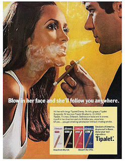
This shoe campaign from Australia promotes the way men think women should look, 'There's a preoccupation with the visual image- of self and others- and a concomitant anxiety about how these images measure up to socially prescribed ideal.' The woman in the advert is tall, slim, well dressed and beautifully. She promotes a body image that most women would like to gain but in some cases is unattainable. This false view of what the typical women looks like puts the women in society in an insecure position, 'beauty advice, fashion tips are effective precisely because somewhere, perhaps even subconsciously, an anxiety, rather than a pleasurable identification is awakened.' This idea of women feeling as though they don't measure up to the women on the billboards or on the magazine is a constant reflection in the public eye. Th way the media has become self-obsessed with image is unhealthy and has an impact on females. The men in this campaign play an important role. The strong image of the male at the front reaching for the women as though she is out of his reach suggests that not only is she unattainable for the women to become her but also for the men who want her. It also suggests that she is some sort of object that can simply grabbed hold of. The unachievable concept in this campaign also implies fantasy rather than reality; 'The saturation of society with images of women has nothing to do with men's natural appreciation of objective beauty, their aesthetic appreciation  and everything to do with an obsessive recording and use of women's images in way to make men comfortable.' This suggests that men are inclined to the idea of certain aspirations of women but when it actually comes down to it, they prefer to stay in their comfort zone and keep things the way they are used to. 'Advertising in this society builds precisely on the creation of an anxiety to the effect that, unless we measure up, we will not be loved.' This proposal of how advertising spends to much time trying to meet up to the societies expectations is intensified in this advert. The media think they know that the public want to see, the 'Mouth, hair, eyes, eyelashes' but in fact it is all built up pressure. The number of males out number the one women in the image, the men having no tops on and sporting a masculine physic suggests a sexual reference. 

Seminar 2- Continued

Chapter 4, 'The Look' in 'Reading Images'
by Rosalind Coward, 1986

The key points and quotes featured within the reading:
  • 'There's a preoccupation with the visual image- of self and others- and a concomitant anxiety about how these images measure up to a socially prescribed ideal.'- This suggests how women should look and how society has created an aim for which each women should to seek to obtain and portrays a sense of anxiety.  

  • 'While I don't wish to suggest there's an intrinsically male way of making images, there can be little doubt that entertainment as we know it is crucially predicted on a masculine investigation of women and a circulation of women's images ford men.'-This statement is implying that the images are created by men, extending the theory that the visual culture is written by the eyes of the male gender. 

  • 'Women is flesh, often feel emobarrassed, irritated or downright angered by men's perseistant gaze...those women on billboards, though; they look back.'- Women in the street often don't appreciate the gaze of the male, it can make them feel objectified and uncomfortable  Therefore it is made less sociably acceptable. However women in the images of billboards and adverts can be notices as their purpose is to appeal to men. They offer engaging looks back which fulfil the male fantasy. 

  • 'In this society, looking has become a crucial aspect of sexual relations'-Suggesting that initially it is the appearance of a a male and female that draws an attraction. The society has become overly concerned with appearance. 

  • 'The saturation of society with images of women has nothing to do with men's natural appreciation of objective beauty...and everything to do with an obsessive recording and use of women's images in ways which make men feel comfortable'-This assumption conveys that in fact it  is to with the way that the male gender view the fantasy rather than the reality. In some ways, the fantasy proves a safer environment.

  • '...women are bound to this power precisely because visual impressions have been elevated to the position of holding the key to our psychic well-being, our social success and indeed to whether or not we will be loved.'-Suggesting that women have to live up to the expectations that have been created by not only by men but supported by society. Women begin to conform to the submissive and passive behaviour that is created in the male fantasy. 

  • '...a preference for looking at women's bodies, for keeping women separate ..perhaps this sex-at-a-distance is the only complete secure relation which men can have with women.'-This idea implies that it is maybe better to just look rather than get too close as their are less consequences and therefore no disappointment.

  • 'Advertising in this society builds precisely on the creation of an anxiety to the effect that, unless we measure up, we will not be loved.'-Women spend too much time and effort trying to meet societies expectations. However these expectations were created by men and their fantasies. 

  • 'Where women's behaviour was previously controlled directly by state, family or church, control of women is now also effected through the scrutiny of women by visual ideals.'-Suggesting that nowadays the women's behaviour is now controlled by their own decisions and there mind based on the images that media expose them to. 


Seminar 2//The Gaze

A Summary

-Subjective and Objective view. 


-People look at others objectively, for example, students. 
-The Gaze looks at women in a objective way.

-Han's Memling 'vanity' (1485) represents social and cultural power. All artists at this point were men until about the late twentieth century. This image would have been painted for men. Creates a fantasy. 


-The female body is naturally more beautiful and delicate. therefore more worthy of artistic study. 

-Nude painting is a way that men can gaze at the female body while retaining class and no guilt. 

-The women is aware she is a sexual objects, knows she is being gazed at and revels in it. 

-A femininity that is create by a male. 

-Tv programmes presents similar ideas through people like Katie Price. Someone is easily controlled, easily persuaded and wants to appeal to men. 

Comparison

-1863, manet's painting rejected. One was looking away and the other looking at you therefore challenging the male gender. Can't see face therefore more of a sexual object and portrays no individual. The other suggests a barrier, more defensive tone. 


With the African slave offering flowers suggests a less male fantasy. 


Much more delicate and softer body positioning. The rose petal in the hand suggests a feminine tough. The way the hair is over the shoulder and the positioning of the head is delicate. The women looking after the child in the corner adds the image as a whole, displaying for a man an ideal women and home lifestyle. 


-1950's 
-Appealing for men
-A delicate gaze
-'My hobby is men', sums up the target audience.  


Irrational message but shows that women can be controlled.  


The power of the gaze. Suggests that the women can take can control of a male. Role reversed. Reflects an assertive femininity. Link product with successful women. A semi naked women looking at a male saying she 'can't cook' therefore proposes disappointment. Either being a domestic wife or a sexual object-two different male fantasies. 

Objectification of women
-Power
-Domination
-Control 

Sexuality
Fem-Submissive/Passive
Masc-Dominent/Active