
1. Virginia Kraljevic
http://www.virginiakraljevic.com/


This website has a fairly simple navigation bar which links to relavent pages. The design is straight to the point and easy to get around the website. The main focus is the actual work rather than the design, the colour is simple and not overpowering.
2. Red Antler
http://redantler.com/about/


This website portrays an easy navigation bar and a very clear layout. The white background allows the brighter coloured type look appropriate and eye-catching. The titles stand out because of the font and point size. In the 'Work' section, the grid format is effective and looks professional.
3. Innocent Drinks
http://www.innocentdrinks.co.uk/


This website shows a good balance between an illustrative style and simple design format. The subtle typeface and clear layout balances out the quirky backgrounds and products. The navigation is incredibly easy to understand and the website does not overload the audience with too much written information.
4. New Zealand Opera
http://nzopera.com/events/


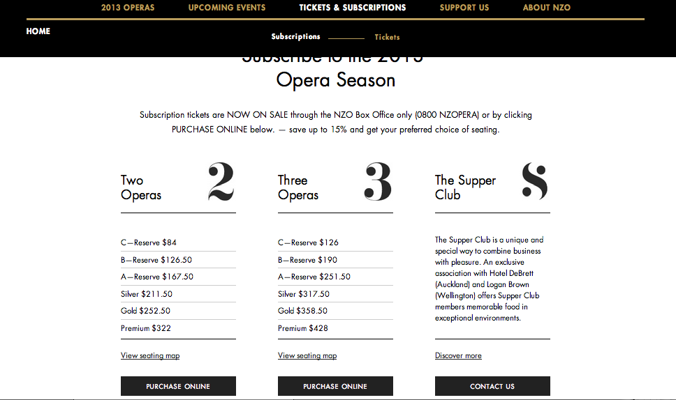
This website is a bit different but is still very easy to navigate The aesthetics are very eye-catching yet the colours are subtle and calming. The typography is a focal point of the landing page, the gold really allows the generic typeface to stand out. Overall, the website has quite a classy and slik look to it.
5. Levis
http://us.levi.com/home/index.jsp?clickid=header_logo


The Levi US website needs to remain pretty simplistic as their are a lot of categories an pages that are linked from the home page. The website keeps its traditional brand identity throughout out the website including colourways and type.
No comments:
Post a Comment