

Here is the starting point to designing the front cover. The book is going to be in a square format (14cm x 14cm) this is because the design on the front needs to fit this specification for it work effectively.

Using illustrator and the guides tool, a square outline was created.

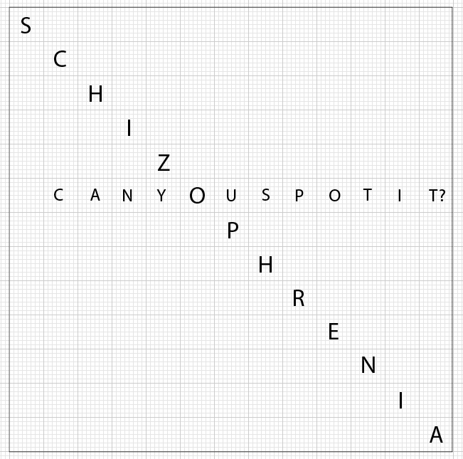
Using the type tool, a letter was placed in each square from the top left corner to the bottom right.

The default 's' was replaced with the word schizophrenia, so this will read diagonally. This word is going needs to be quite bold and bigger than the other text.

Using the 'o' from the schizophrenia, the phrase 'can you spot it?' was inserted horizontally. This poses a question relavent to the subject matter.

After removing the guides and grid background, this is what the cover would look like so far. The 'Can you spot it?' has been highlighted in green on purpose and this shows it would actually be written in uv ink. So that when the uv light is shone over the book cover, this question would appear.

Here shows how the kerning and placement with the type was laid out. As the front cover is going to be type based, it is important to consider hierarchies and legibility.


As more and more letters start to fill this grid layout, it becomes obvious that it communicating a word search, highlighting the word 'Schizophrenia' and the phrase 'Can you spot it?'.

This is what it would look like without the guides. As you can see the type in the background is much smaller and less intense to help the key text stand out.
No comments:
Post a Comment