
Here are some photographs of the glow in the dark pen being applied. As the printed type has a clean and minimal aesthetic the idea was to have the writing and diagrams in a handwritten, almost messy way. This switches the tone of voice from being informative in a theory manner to a diary like way. Using phrases like 'why me' gives it a more personal and realistic tone of voice opposite to what is expected.


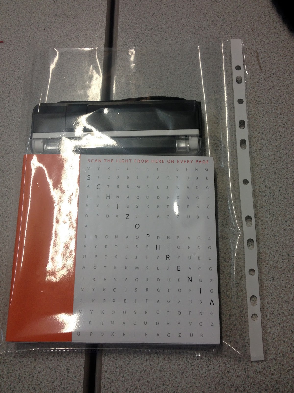
The book was made to be a square (16cm x 16cm) mainly because the UV light is this width so it would fit perfectly in the packaging.
No comments:
Post a Comment