
Packaging has become an art form in itself. Brands experiment with various styles of packaging depending on the appropriateness and aesthetic.

This packaging above strongly shows how the design of the product informs the design. The laser cut enables for the product to be shown and therefore allow a clear line of communication to the audience. This simple rectangle box has been made unique through a simple and cheap process.

At first glance, this product looks eye catching in the way it is packaging but it isn't very clear what is inside. The shapes and aesthetics enhance the design however it is no way clarifying the function of the product. Even by just adding type, this problem could be addressed.

This packaging is simple and let the design of the product speak for itself. The product is obvious, however it isn't the most practical and substantial packaging.


A company decided to package apples in a tennis ball tube. Here it is the shape informing the design. At a far, it can be misleading as to what in the tube. The audience may assume it is tennis ball but closer up realise they are actually apples. This concept is clever and the design really suits the product.
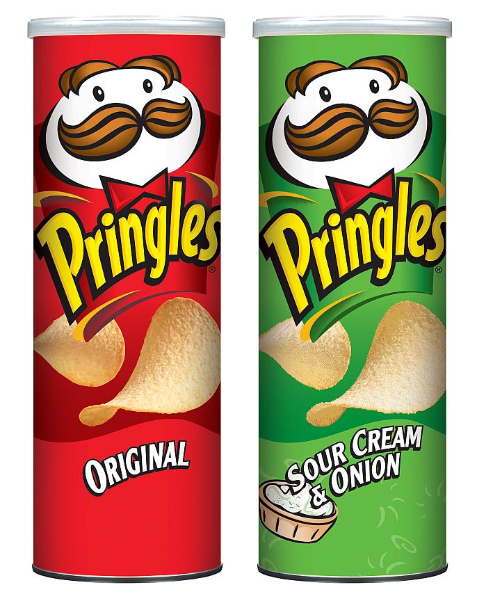
It is interesting when different products are packaged in very similar nets and boxes. Pringles is known for arriving in a tube cylinder and yet again even though the shape of them in no ways resembles a tennis ball, it seems to work for the product.

Kleenex put a spin on there current packaging. Here, rather than the product informing the box, the aesthetics have taken control. The shape has been designed like a segment of fruit, mirroring the aesthetics.

Here is another example of the aesthetics creating an illusion with packaging. The design itself is very minimalist yet pulled off so well. With no written information, purely form, it is clear to what flavour drink is inside each carton.
http://pinterest.com/search/pins/?q=packaging
No comments:
Post a Comment